Effective tax rates in the United States
For the most part, the world of personal finance is calm and collected. There's not a lot of bickering. Writers (and readers) agree on most concepts and most solutions. And when we do disagree, it's generally because we're coming from different places.
Take getting out of debt, for instance. This is one of those topics where people do disagree — but they disagree politely.
Hardcore numbers nerds insist that if you're in debt, you ought to repay high-interest obligations first. The math says this is the smartest path. Other folks, including me, argue that other approaches are valid. You might pay off debts with emotional baggage first. And many people would benefit from repaying debt from smallest balance to highest balance — the Dave Ramsey approach — rather than focusing on interest rates.
That said, some money topics can be very, very contentious.
Any time I write about money and relationships (especially divorce), I know the debate will get lively. Should you rent a home or should you buy? That question gets people fired up too. What's the definition of retirement? Should you give up your car and find another way to get around?
But out of all the topics I've ever covered at Get Rich Slowly, perhaps the most incendiary has been taxes. People have a lot of deeply-held beliefs about taxes, and they don't appreciate when they read info that contradicts these beliefs. Chaos ensues.
Tax Facts
When I do write about taxes — which isn't often — I try to stick to facts and steer clear of opinions. Examples:
- The U.S. tax burden is relatively low when compared to other countries.
- The U.S. tax burden is relatively low when compared to U.S. tax burdens in the past.
- Overall, the U.S. has a progressive tax system. People who earn more pay more. That said, certain taxes are regressive (meaning that, as a percentage of income, low earners pay more).
- A large number of Americans (roughly one-third) pay no federal income tax at all.
- Despite fiery rhetoric, no one political party is better with taxing and spending than the other. The only period during the past fifty years in which the U.S. government had a budget surplus was 1998-2001 under President Bill Clinton and a Republican-controlled Congress.
Even when I state these facts, there are people who disagree with me. They don't agree that these are facts. Or they don't agree these facts are relevant.
Also, I sometimes read complaints that the wealthy are taxed too much. To make their argument, writers make statements like, “The top 50% of taxpayers pay 97% of all federal income taxes.” While this statement is true, I don't feel like it's a true measure of where tax burdens fall.
I believe there's a better, more accurate way to analyze tax burdens.
Effective Tax Burden
To me, what matters more than nominal tax dollars paid is each individual's effective tax burden.
Your effective tax burden is usually defined as your total tax paid as a percentage of your income. If you take every tax dollar you pay — federal income tax, state income tax, property tax, sales tax, and so on — then divide this total by how much you've earned, what is that percentage?
This morning, while curating links for Apex Money — my second personal finance site, which is devoted to sharing top money stories from around the web — I found an interesting infographic from Visual Capitalist. (VC is a great site, by the way. Love it.) They've created a graphic that visualizes effective tax rates by state.
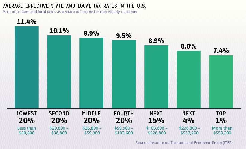
Here's a summary graph (not the main visualization):
As you can see, on average the top 1% of income earners in the U.S. have a state effective tax rate of 7.4%. The middle 60% of U.S. workers have a state effective tax rate of around 10%. And the bottom 20% of income earners (which Visual Capitalist incorrectly labels “poorest Americans” — wealth and income are not the same thing) have a state effective tax rate of 11.4%.
Tangent: This conflation of wealth with income continues to grate on my nerves. I'll grant that there's probably a correlation between the two, but they are not the same thing. For the past few years, I've had a low income. I'm in the bottom 20% of income earners. But I am not poor. I have a net worth of $1.5 million. And I know plenty of people — hey, brother! — with high incomes and low net worths.
It's important to note — and this caused me confusion, which meant I had to revise this article — that the Visual Capital numbers are for state and local taxes only. They don't include federal income taxes. (Coincidentally, I made a similar mistake a decade ago when writing about marginal tax rates. I had to make corrections to that article too. Sigh.)
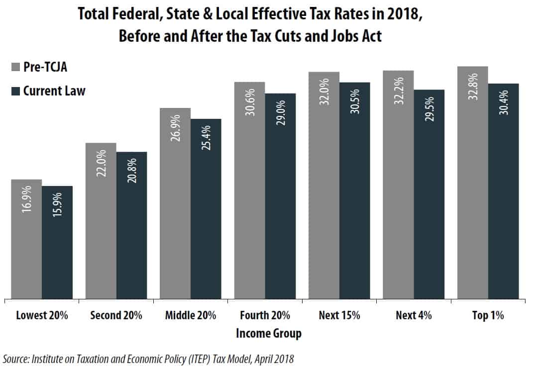
GRS readers quickly helped me remedy my mistake, pointing to the nonprofit Tax Foundation's summary of federal income tax data. With a bit of detective work, I uncovered this graph of federal effective tax rates by income from the Peter G. Peterson Foundation. (Come on. What parent names their kid Peter Peterson? That's mean.)
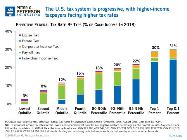
Let's put this all together! According to the Institute on Taxation on Economic Policy, this graph represents total effective tax rates for folks of various income levels. Note that this graph is explicitly comparing projected numbers in 2018 for a) the existing tax laws (in blue) and b) the previous tax laws (in grey).
Total Tax Burden vs. Total Income
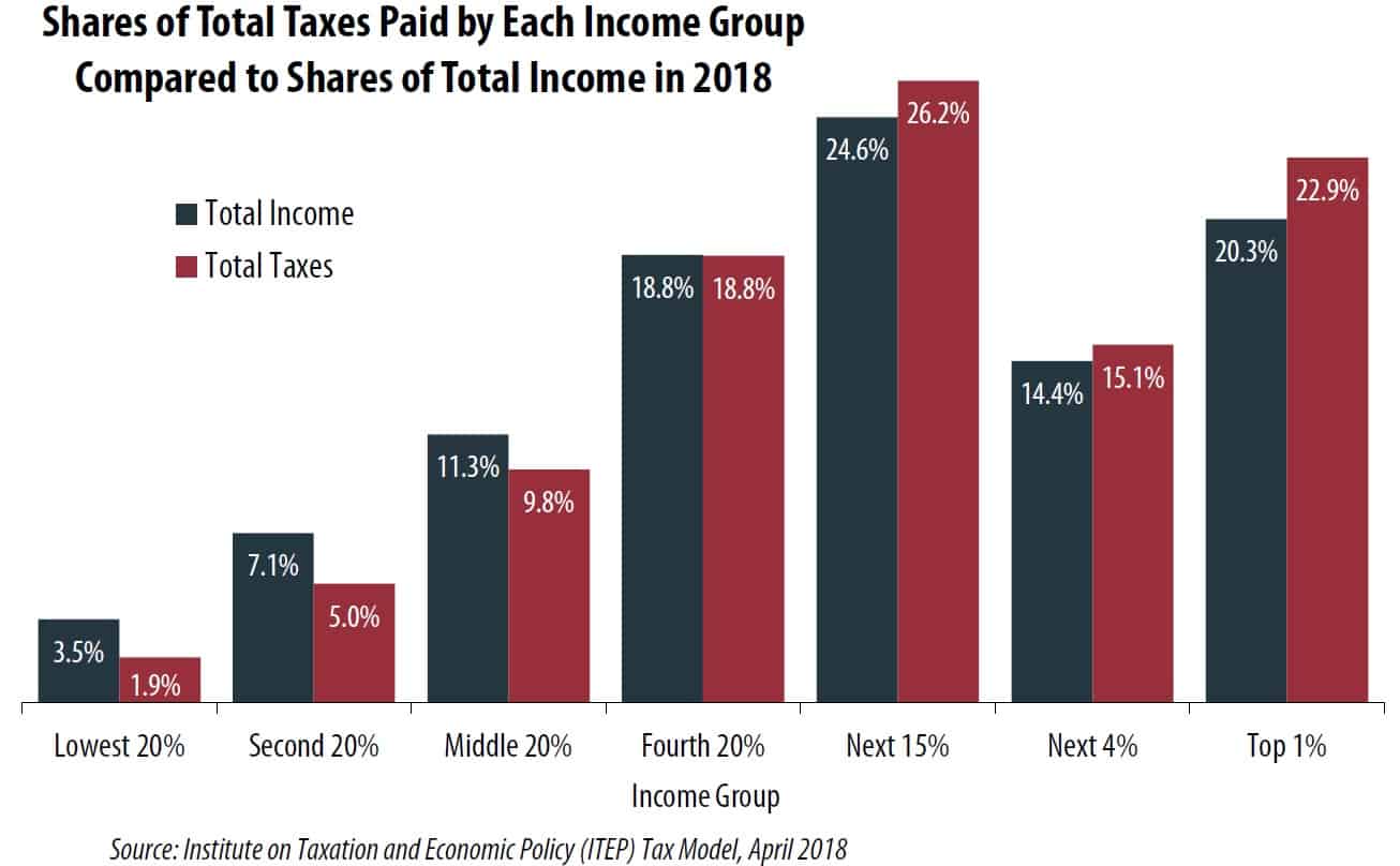
Here's one final graph, also from the Institute on Taxation and Economic Policy. This is the graph that I personally find the most interesting. It compares the share of total taxes paid by each income group to their share of the country's total income.
Collectively, the bottom 20% of income earners in the United States earned 3.5% of total income. They paid 1.9% of the total tax bill. The top 1% of income earners in the U.S. earned one-fifth of the nation's total personal income. They paid 22.9% of total taxes.
Is the U.S. tax system fair? Should people with high incomes pay more? Do they pay more than their fair share? Should low-income workers pay more? Are we talking about numbers that are so close together that it doesn't matter? I don't know and, truthfully, I don't care. I'm concerned with personal finance not politics. But I do care about facts. And civility.
The problem with discussions about taxation is that people talk about different things. When some folks argue, they're talking about marginal tax rates. Others are talking about effective tax rates. Still others are talking about actual, nominal numbers. When some people talk about wealth, they mean income. Others — correctly — mean net worth. It's all very confusing, even to smart people who mean well.
Final Note
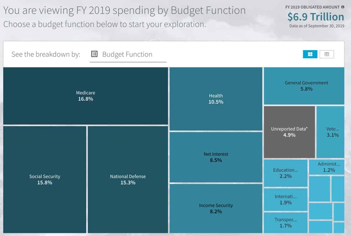
Under the Digital Accountability and Transparency Act of 2014, the U.S. Department of the Treasury was required to establish a website — USASpending.gov — to provide the American public with info on how the federal government spends its money. While the usability of the site could use some work, it does provide a lot of information, and I'm sure it'll become one of my go-to tools when writing about taxes. (I intend to update a couple of my older articles this year.)
The USA Spending site has a Data Lab that's currently in public beta-testing. This subsite provides even more ways to explore how the government spends your money. (I also found another simple budget-visualization tool from Brad Flyon at Learn Forever Learn.)
Okay, that's all I have for today. Let the bickering begin!
Become A Money Boss And Join 15,000 Others
Subscribe to the GRS Insider (FREE) and we’ll give you a copy of the Money Boss Manifesto (also FREE)


